Below is an example of a box plot, explaining what each part means.
 Breakdown of a box plot, Thomas-Gay - StudySmarter Originals
From a box plot you can then find out the interquartile range. This can be calculated by subtracting the lower quartile from the upper quartile.
For example, in the picture above the interquartile range would be
.
Knowing this can also help you identify any outliers, as an outlier is known to be any piece of data that is 1.5 the interquartile range above the upper quartile or 1.5 the interquartile range below the lower quartile.
Using the example above, to find out what would be a lower outlier you can simply calculate it. so this means that an outlier will be any piece of data less than 2.5, which is why the data piece marked as 1.5 is classed as an outlier.
How to plot a box plot?
In order to plot a box plot, you need the following,
Lowest value.
Lower quartile (Q1).
Median (Q2).
Upper quartile (Q3).
Highest value.
You don't necessarily need an outlier in order to draw a box plot as there may not be any found in the data.
When you are asked to draw a box plot you may have data presented to you in a table or you may have each of the above features listed for you, let's work through both examples and how you would plot them.
When the data are given to you like this, you can simply draw your box plot without needing to do any calculations.
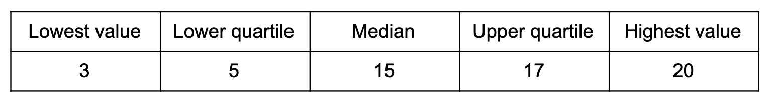
To create the box plot for this data, you would add a line at the suitable point for each feature and then connect them to create a box.
 Plotting a box plot, Thomas-Gay - StudySmarter Originals
However, sometimes the data may not be presented clearly – you may be given a list of data, as given in the next example.
Here is a sample of test scores from a class quiz, 47, 50, 62, 76, 98, 54, 38, 66, 24, 82.
Represent the following set into a box plot.
Solution
First, you can start by arranging the data into ascending numerical order,24, 38, 47, 50, 54, 62, 66, 76, 82, 98
By doing this you can see that 24 is your lowest value and 98 is the highest value. To find the median you need to find the middle number, since there are 10 numbers you will need to take the midpoint of the two middle numbers:
Now you need to find your lower quartile and upper quartile. The lower quartile can be found by finding the midpoint between your lowest value and the median, and the upper quartile can be found by finding the midpoint between your midpoint of the highest value:
24, 38, 47, 50, 54, 62, 66, 76, 82, 98
You can see that the lower quartile is 47 and your upper quartile is 76.
Once you have gathered all of the information you are able to draw your box plot:
 Plotting a box plot, Thomas-Gay - StudySmarter Originals
How to interpret a box plot
It is very important to understand how to interpret a box plot. You should know how to identify the different features that are presented in a box plot as well as using the information you are given to compare box plots. Below is an example of a box plot – let's take a look at it and work through some potential questions you may come across.
The box plot below shows the height of a group of boys,
 Interpreting a box plot, Thomas-Gay - StudySmarter Originals
Here are some examples of questions you may be asked about the box plot,
What are the lower and upper quartiles?
You know that the upper and lower quartiles are what make up the box, so you can see that the lower quartile is 160.5 and the upper quartile is 165.5.
Calculate the interquartile range
To do this you can take the lower quartile and subtract it from the upper quartile,
What is the median?
This can be identified by looking at the box plot and finding the middle line of the box, which is 163.
Box plots can also be used to compare data, for example, data representing the height of a group of girls can be placed below the original box plot to help you compare and contrast.
 Comparative box plot, Thomas-Gay - Originals
Here are some examples of questions you may be asked about the two box plots.
Compare the heights of males and females
For this question, you can describe what you can see on the box plots. The box plots show that males have a higher value and higher median than females, meaning that the males are taller.
What is the highest value of heights of females?
For this question you only need to look at the female box plot, it shows that the highest value is 163.
A person was measured at a height of 162cm, give a reason why they are more likely to be male or female?
For this question you will need to look at both of the box plots, you can see that there are much more males that had a height of 162 or higher, which means that it is more likely to be a male that was measured at 162.
Box plots - key takeaways
A box plot is used to visually display certain features of data.
A box plot shows you the lowest value, lower quartile, median, upper quartile and the highest value, as well as any outliers there may be in the data.
An outlier can be described as a piece of data that is 1.5 x the interquartile range below the lower quartile or above the upper quartile.
You can draw more than one box plot on the scale to help you compare the data.


