The use of a frequency polygon has been shown to be very useful for trend analysis and data recall.
Example of a frequency polygon
Below is an example of a frequency polygon.
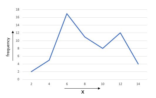
Example of a frequency polygon, Nilabhro Datta - StudySmarter OriginalsThe value of the data point is plotted along the horizontal axis, and the frequency corresponding to each data point is plotted along the vertical axis. So from the above graph, we can deduce that for x = 10, frequency = 8. We will explore further nuances of frequency polygons later on.
How to draw a frequency polygon
Given a grouped frequency distribution, follow the following steps to draw the corresponding frequency polygon.
1) Find the class mark for each class interval of the frequency distribution. To make it easier, you can add another column to the frequency distribution to note down the class marks.
class mark = \(\frac{\text{upper limit + lower limit}}{2}\)
2) Plot the class marks along the horizontal axis and the frequencies along the vertical axis.
3) For each class mark, plot the frequency corresponding to that class on the graph.
4) Join all the plotted points in sequential order (connect the first point with the second, then the second to the third, and so on ...)
5) The resulting figure is the necessary frequency polygon.
Example
Draw the frequency polygon graph for the following frequency distribution:
Class | frequencies |
5-7 | 15 |
7-9 | 18 |
9-11 | 28 |
11-13 | 7 |
13-15 | 22 |
15-17 | 35 |
Solutions
First, let's find the class mark for each class. We can show the results in the following table:
Class | Class Mark | frequencies |
5-7 | 6 | 15 |
7-9 | ![]()
| 18 |
9-11 | 10 | 28 |
11-13 | 12 | 7 |
13-15 | 14 | 22 |
15-17 | 16 | 35 |
Now that we have all the class marks and the corresponding frequencies, we can plot the points on the graph taking the class marks on the horizontal axis and the frequencies on the vertical axis.
 The graph after plotting the requisite points, Nilabhro Datta - StudySmarter originals
Finally, we have to join the plotted points sequentially.
 The final frequency polygon, Nilabhro Datta - StudySmarter originals
The above diagram is our final frequency polygon.
Here are a few things to be mindful of when creating your own frequency polygon:
Make sure you use the class mark and not the class limits to plot the graph.
Sometimes you may want to obtain a closed polygon. In such cases, you could extrapolate the classes to the expected next class in either direction and consider the frequency of each class to be 0. In the above example, this would mean adding the classes (4, 0) and (18, 0) – since the expected next class mark on the left-hand side is 4 and on the right-hand side is 0.
Frequency polygons from histograms
Frequency polygons share many similarities with Histograms. Both histograms and frequency polygons are used to graphically represent frequency distribution. While frequency polygons can be drawn with or without a corresponding histogram, it is very easy to obtain a frequency polygon from a given histogram.
To draw a frequency polygon from a given histogram, join the middle of the top of each bar of the histogram sequentially.
This is effectively equivalent to the same process that we followed to draw our frequency polygon. The horizontal middle of the bar of a histogram is the class mark, and the top of the histogram is the corresponding frequency. Thus the middle of the top of each bar gives the point to plot on the graph, and by joining these points we get the frequency polygon.
Example
 Frequency polygon from a histogram. Image: ECDC CC BY 4.0
In the above example, the frequency polygon is obtained by joining the middle of the top of each bar of the histogram sequentially.
Frequency Polygons - Key takeaways
A frequency polygon is a graphical representation of a data set with frequency information. It is one of the most common statistical tools used to represent and analyse grouped statistical data.
To draw a frequency polygon from a given grouped frequency distribution, we must plot the frequency against the class marks and not the class boundaries.
While frequency polygons can be drawn with or without a corresponding histogram, it is very easy to obtain a frequency polygon from a given histogram.


